The second guideline from the Stanford Web Credibility Project is Show that there’s a real organization behind your site. Sites who are known entities, like Amazon.com and BestBuy.com, don’t have to worry much about this one – consumers know that the site is backed by a large, stable organization. While they may still worry about product quality or speedy delivery, they have little concern that they won’t be able to find the vendor if they have a problem a week later. The Stanford researchers suggest,
Showing that your web site is for a legitimate organization will boost the site’s credibility. The easiest way to do this is by listing a physical address. Other features can also help, such as posting a photo of your offices or listing a membership with the chamber of commerce.
Let’s look at some real-life examples. I randomly chose to search for “bass fishing lure” to try to spot some online marketers who weren’t in the same class as Amazon or Target. One of my first stops was ebait.com. I had high hopes for a site that featured a fairly relevant five-letter dot-com, but the design, or lack thereof, made the site look like a refugee from 1996 that woke up a decade later. Putting aside that and other considerations, how did they do on Credibility Criterion #2? Well, it’s a mixed bag. They DO have both a street address and a phone number. In addition, the About Us page is “signed” by the owner/founder. Still, the “about” message is mostly marketing blather. There’s very little that tells us anything about ebait.com as a company. Grade: B-
Our next stop was HighRoller Lures. Certainly, this site looks a lot more credible than the last one. The design is of good quality, there are lots of product photos and, more important, people photos. The text talks about the success their products have achieved, and the overall feel is that this is a real company. Surprisingly, the site falls a bit short in our criterion du jour. They provide an address, along with regular and toll free numbers (good), but the address is a PO Box (bad). There’s no obvious “about” page, but a page labeled “Introduction” seems to serve that purpose. The page talks in glowing terms about the products and their evolution, but says virtually nothing about the company. There’s a picture of a guy holding a big fish labeled “Capt. Blair Wiggins”, but he seems to be a celebrity user rather than a company principal. This website does a lot of things very well, but we’d like to see the founder or owner’s name and picture, too. And if they actually make these lures (vs. farming out manufacturing to a nameless sweat shop on another continent), how about a picture of a worker putting the finishing touches on a product? Even if the factory is in someone’s pole barn, a tight shot would disguise the surroundings but emphasize that real people make these things. Grade: B
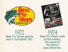
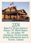
 Our final stop was Bass Pro Shops. This site is significantly more polished, and they include plenty of credibility boosting info. In their press information session, they have a page showing how their facilities have evolved over the years, culminating in the most recent stores they have opened.
  On another page, they have an illustration of their huge corporate headquarters, complete with massive warehouse and cubicles or order serfs. No credibility issues here. If I have a complaint, it’s that I had to click on a non-obvious “Press Kit” link to find this content. The “Contact” page has no street address, and there’s no obvious “About Us” page. I’m sure this company is well known in its segment and probably doesn’t think it needs to talk about itself, but I’m sure some first-time visitors would like the easy reassurance of a short “about” page; a little text explaining the national presence of the firm, a few HQ and store photos, a physical address, and a CEO pic would put them way ahead of any competitors for Criterion #2. Grade: A-
“I’m tiny – how do I address Criterion #2?” Not every site owner has a fancy corporate headquarters, a multi-acre warehouse, or a bevy of smiling employees. The short answer is, “work with what you have”. Put a street address on your website. A phone number is a good idea, too. If you have products, even if they are stored in a corner of your garage, take a picture of an employee (or a relative or friend) appearing to pick an order. If your facility is somewhere between inadequate and nonexistent, tightly focused shots are your friend. A photo of the owner, along with his or her name, helps. I’ve seen plenty of firms who rent a tiny office put in a photo of the entire office building and label it, “corporate headquarters”. Be cautious with this approach, as it is often painfully obvious that a small company is trying to look big. Instead of raising doubts, boost your credibility by being honest – put in the shot of the fancy office building, but don’t imply ownership, just say something like, “Our offices are in the Acme Building.” And, of course, provide the address.
Almost every site can do a better job of Credibility Criterion #2. Do you have a physical address, a phone number, and photos of your facility and/or people? And, more importantly, are they easy for a first-time visitor to find?