Chances are, your website or app has at least one form. An order form, an info request form, a subscription form… no surprise. But, here’s what may surprise you: there’s a good chance it’s not coded to minimize customer effort. And, we know what that means… more effort = more friction = fewer leads or orders.
 Here’s the opportunity to get more completed forms… if your customers are using a browser like Chrome that has a powerful autocomplete function, it’s possible for them to type a few characters in the first field and, with one click, have the rest of the form filled. No need to retype their email, their street address, their fax number. (Just seeing if you are paying attention – please tell me your form doesn’t still have a field for “fax number!”) Even credit card information can be auto-filled, saving all the effort involved in grabbing a wallet or purse, extracting the card, and entering all of the fields.
This isn’t a new thing. Matt Cutts, then with Google, introduced it back in 2013 at Pubcon, the biggest digital marketing conference.
@rogerdooley definitely good to decrease the friction..
— Matt Cutts (@mattcutts) October 24, 2013
Despite the maturity of autocomplete technology, every day I see poorly coded forms that prevent it from working right. All too often, when I start a form and click the autofill option that Chrome displays, the fields don’t populate correctly. Some that should have been filled are blank. Or, a telephone number is inserted in the email address field.
Roger That
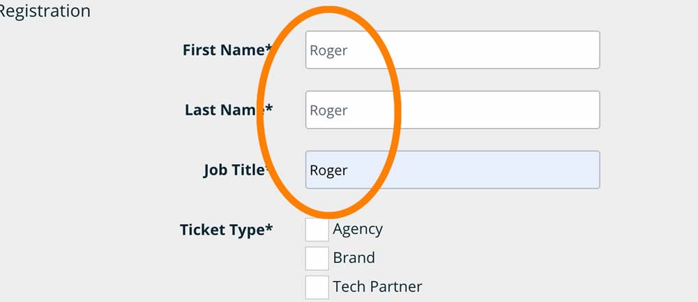
The other day, I ran across one of the best (or worst) examples of a form that looked fine but entirely failed to autocomplete. Every single form field auto-populated with “Roger.” Every single one! Clearly, the programmer just copied and pasted the code from the first field of a form and changed the visible field names. But, this error is invisible to everyone from the user to the CMO – until they actually try to complete the form!
I won’t embarrass the company on whose website I found this form. They are a tech firm staffed with very smart people. The problematic form wasn’t even theirs – it appeared to be embedded code from another company processing event registrations. But even very smart teams can miss this kind of error because the form looked fine and nobody tested it by going through the process of completing it.
This kind of friction is entirely avoidable. As part of your user experience effort, be certain that forms can be autocompleted accurately and completely. You’ll get more completed forms and fewer frustrated customers!
 Join the fight against unnecessary friction! When you encounter an annoying or time-wasting user experience, post about it with the hashtag #FrictionHunter. Or, send me an email: friction at rogerdooley dot com. There’s an old saying, “the best disinfectant is sunlight” – let’s change that to, “the best lubricant is #FrictionHunter exposure!”
