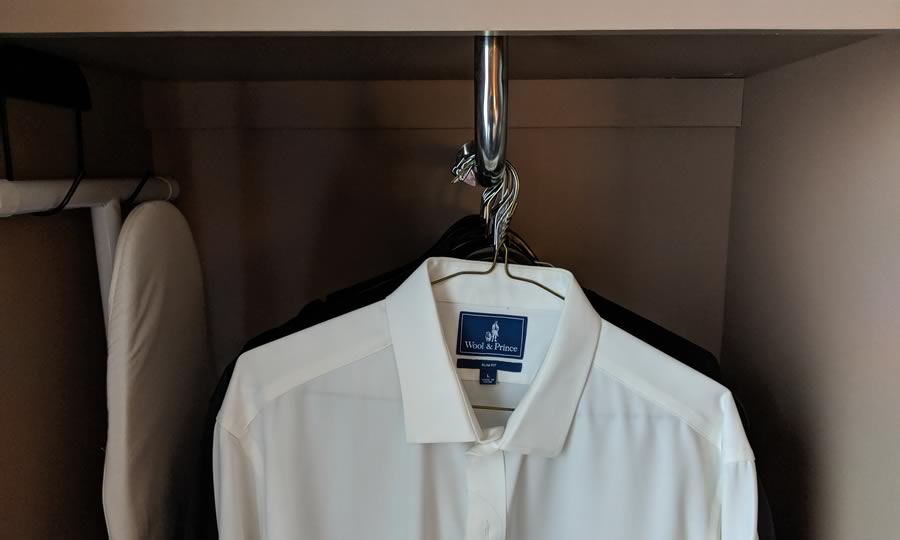
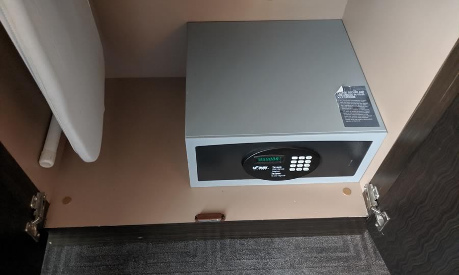
I’m going to bring some friction out of the closet, literally. Although closet designs in hotel rooms are usually unremarkable, I encountered on that made me scratch my head and wonder, “What were they thinking?”
Hotel rooms often have design features that aren’t guest-friendly. At FlyerTalk, the forum for frequent travelers, I’ve seen threads with dozens or even hundreds of posts discussing poor designs encountered during hotel stays. Bathrooms without doors, awkward furniture placement, zero counter space, and many more flaws come under fire. One memorable photo showed a shower that looked like a phone-booth-size glass cylinder – in the middle of the room! Closets, oddly enough, rarely appear in these rants – there’s not that much to go wrong in such a simple element. At least, usually.
On one recent stay in an otherwise excellent hotel I encountered a closet with multiple perplexing design features. (I’m not going to out the specific hotel, as the staff were great and the overall guest experience was fine.)
The first oddity was the orientation of the hanger rack. In both homes and hotels, virtually all closets position the rack “side to side” so that the user can see all of the clothing and easily remove or add an item. This hotel closet positioned the rack “end on” so that one could only view the first item – everything else was hidden.

Now, in terms of inconvenience, this wasn’t a huge problem. One could push items to the side to access those in back. But one has to wonder – why did the designer decide to buck centuries of closet design tradition and incorporate this obviously less usable design? I didn’t get out my tape measure, but it appeared a side-to-side rack would have fit equally well.
A Safe Location
The real design failure in this closet wasn’t the weirdly oriented rack. It was the positioning of the room safe, which was on the floor. Literally.

In order to read the instructions and push the safe’s buttons, guests would have to be on their hands and knees. To view the back of the safe to ensure no valuables remained, guests would have to be prone on the hotel room floor.
What Didn’t Happen
As I pondered this almost unusable design, I imagined a group of hotel executives watching a video of a “test guest” unpacking and awkwardly placing his clothes on the rack. When he gets down on his hands and knees to struggle with the safe, the execs all high-five each other and exclaim, “Now that is the customer experience we are looking for!”
Of course, that’s not what happened. Nobody tested this design, or even asked a guest about it. Nobody consulted with a few experienced travelers about the practicality of placing the safe on the floor. Instead, the designers made a decision to put the safe in that ridiculous location because it was cheapest or most convenient for them. Nobody checked to see if there was a safe design with top access to make a lower location more practical.
A Metaphor for All Customer Experience
There’s a far more important issue at stake than one bad hotel closet design. A common refrain in those FlyerTalk threads is, “Did the designer ever actually stay in a room like this? Or in any hotel, ever?” Some of these usability flaws seem so obvious that it seems likely that:
- The designer was inexperienced and/or clueless.
- Nobody bothered to test the design with real guests.
The same thing happens on websites, in mobile apps, and in-person customer experiences. You have almost certainly encountered a digital interface that is so perplexing that you concluded the company performed no user testing at all.
Most friction isn’t intentional. Even smart, experienced designers can overlook elements in a process that will confuse or frustrate first-time users. Two simple steps will help you avoid at least some friction in your customer experience:
- Test your processes with real customers.
- After launch, continuously monitor and aggregate behavior data to identify problem areas.
Whose convenience?
Most companies claim to put the customer first, or to be customer-centric. But, few really are. When faced with a significant cost to improve customer experience, the company puts its own needs first. It’s entirely possible that when that hotel was being designed, someone pointed out that the floor was a terrible place to put a room safe. When the cost of a more convenient location was calculated, though, someone consciously decided that a better customer experience wasn’t worth it.
When I encountered an inexplicably bad user experience on a major website, I used to assume the firm didn’t have a competent UX person. Now, I lean toward the explanation that they DO have people who understand UX but those experts are overruled by executives in finance, IT, or security.
If you want to be truly customer-centric, be certain that your customer experience people have at least as much authority as the rest of the decision-makers.
 Join the fight against unnecessary friction! When you encounter an annoying or time-wasting user experience, post about it with the hashtag #FrictionHunter. Or, send me an email: friction at rogerdooley dot com. There’s an old saying, “the best disinfectant is sunlight” – let’s change that to, “the best lubricant is #FrictionHunter exposure!”